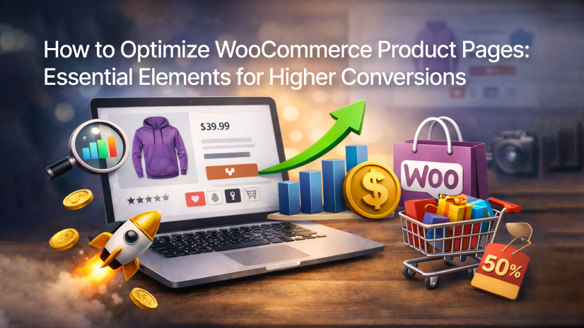
The Essential Guide to Optimizing WooCommerce Product Pages for Conversions
Are you driving a significant amount of traffic to your online store, only to see a disappointing conversion rate? It’s a common and frustrating pain point for many e-commerce entrepreneurs: you’ve mastered the art of digital marketing, your ads are clicking, and your social media is buzzing, yet visitors leave without making a purchase. The "leaky bucket" syndrome in e-commerce is almost always traced back to one specific location: the product page.
In the competitive global market of 2026, getting a click is only the beginning of the journey. On a successful e-commerce site, your product pages are your most important, tireless salespeople. Unlike a physical storefront where a sales clerk can read body language, answer spontaneous questions, and overcome objections in real-time, your WooCommerce product page optimization must do all that heavy lifting automatically. Every pixel, every word, and every millisecond of load time directly impacts user trust and their ultimate decision to buy.
In this exhaustive guide, Jupiter Technoway—a leading e-commerce development company in Ahmedabad—will walk you through the essential elements required to transform your standard WooCommerce pages into high-converting assets.
The Visual & Informational Foundation
1.1 Compelling Product Visuals: The Eyes Buy First
In digital commerce, the "tactile gap" is your biggest enemy. Customers cannot pick up, turn over, or feel the texture of your items. Therefore, your WooCommerce product images are the only bridge between a curious browser and a confident buyer.
- Professional Photography Standards: High-resolution images are a non-negotiable baseline. Use a "zoom-on-hover" feature to allow customers to inspect stitching, textures, or technical components. Grainy, poorly lit, or "stock-looking" photos instantly erode brand authority.
- The 360-Degree Perspective: Don't stop at one or two photos. Provide a complete gallery showing the product from the front, back, sides, and top.
- Contextual Lifestyle Shots: While "hero shots" on white backgrounds are great for clarity, lifestyle images help customers visualize the product in their own lives. If you sell furniture, show it in a styled room. If you sell apparel, show it on a person with listed height/size details.
- Solving the Variation Confusion: One of the biggest conversion killers is a lack of visual clarity for WooCommerce product variations. If a customer clicks "Forest Green" but the main image remains "Midnight Black," cognitive dissonance sets in. A high-converting page must dynamically swap images to match the selected variation.
- Incorporating Product Videos: Video is the closest thing to an in-person demonstration. Short 30-to-60-second clips showing the product in motion, or a "unboxing" feel, can humanize your brand and clarify the product’s scale and functionality.
- Optimization for Performance: High quality must not come at the cost of speed. Heavy images are the #1 cause of slow sites. As an e-commerce website development agency, we recommend using Next-Gen formats like WebP and implementing lazy loading to ensure WooCommerce page speed remains optimal.
1.2 Persuasive & Clear Product Content: How to Write Product Descriptions That Sell
While images grab attention, words close the deal. Most WooCommerce sites fail because they simply copy-paste the manufacturer's technical specifications. To stand out, you need to master how to write product descriptions that sell.
- The Benefit-Driven Headline: Your product title shouldn't just be a model number. Combine the name with a motivational, benefit-driven pitch.
- Bad: "Model X200 Ergonomic Chair"
- Good: "Model X200 Ergonomic Chair: Say Goodbye to Back Pain and Boost Your Focus."
- The Feature-to-Benefit Flip: Don't just tell the customer what a product is; tell them what it does for them.
- Feature: "Waterproof 600D Polyester."
- Benefit: "Keep your laptop bone-dry even during unexpected tropical downpours."
- Emotional Resonance: Use sensory language. Instead of "soft fabric," use "buttery-soft, breathable bamboo cotton that feels like a second skin."
- Scannable Hierarchies: Modern shoppers scan; they don't read. Use bullet points for key features, bold text for emphasis, and expandable "Accordion" sections for technical data. This keeps the layout clean while providing deep information for those who want it.
- Proactive FAQs: If you notice the same questions appearing in your support inbox, put the answers directly on the product page. Providing size charts, material origins, and shipping timelines directly reduces "buyer's hesitation."
Building Trust & Reducing Friction
2.1 Leverage Social Proof & Trust Signals
Trust is the primary currency of the internet. In an era of "dropshipping" and faceless stores, proving you are a legitimate, high-quality business is essential to increasing WooCommerce conversion rate.
- The Power of WooCommerce Product Reviews: Social proof is more persuasive than any marketing copy. Display star ratings prominently under the product title.
- User-Generated Content (UGC): Encourage customers to upload their own photos with their reviews. Seeing a "real" person using the product in a non-studio setting is incredibly powerful for building authenticity.
- WooCommerce Trust Badges: Strategically place security icons (SSL, Norton, McAfee) and payment logos (Visa, MasterCard, PayPal) near the WooCommerce call to action button. These small visual cues act as a psychological "safety net" during the vulnerable moment before a click.
- Press and Awards: If your brand has been featured in the media or won local industry awards, display those logos. It positions you as an authority in your niche.
2.2 Unmissable Calls-to-Action (CTAs) & Simple Navigation
If a user has to search for the "Add to Cart" button, you’ve already lost the sale.
- High-Contrast Design: Your WooCommerce call to action button should be the most visually striking element on the page. Use a color that contrasts sharply with your site’s primary palette (e.g., a bright orange button on a blue and white theme).
- Sticky CTAs: As users scroll down to read reviews or specs, the "Add to Cart" button often disappears. Implementing a "sticky" CTA bar that stays at the top or bottom of the screen ensures the option to buy is always one tap away.
- Streamlined Navigation: Use breadcrumbs (e.g., Home > Electronics > Audio > Headphones) to help users understand where they are. This improves SEO and makes it easy for users to explore related categories without hitting the "back" button.
Advanced Optimization & Technical Performance
3.1 Create Urgency & Enhance Decision-Making
Human psychology is wired to respond to scarcity and urgency. Use this to move "window shoppers" toward a purchase.
- Stock Levels & Low-Stock Alerts: Displaying "Only 2 left in stock!" creates a natural FOMO (Fear Of Missing Out).
- Countdown Timers: For limited-time offers or "order within the next 2 hours for next-day shipping," countdown timers create a sense of immediate action.
- Smart Product Recommendations: Use "Frequently Bought Together" (Cross-selling) or "You May Also Like" (Up-selling) sections. This mimics the experience of a helpful store assistant and significantly increases your average order value (AOV).
3.2 Prioritizing the Mobile Experience
In 2026, more than 70% of e-commerce traffic comes from mobile devices. If your store isn't WooCommerce mobile-friendly, you are effectively turning away the majority of your customers.
- Thumb-Friendly Design: Ensure buttons are large enough to be easily tapped. Avoid placing clickable elements too close together.
- Responsive Typography: Text must be legible on small screens without the user needing to pinch and zoom.
- Mobile Speed: Mobile users are even less patient than desktop users. Every second of delay on a mobile network leads to a massive spike in bounce rates.
3.3 The Final Hurdle: WooCommerce Checkout Optimization
The product page's job is to get the item into the cart; the checkout's job is to finalize the deal. Reduce WooCommerce cart abandonment by making this final step invisible.
- WooCommerce One Page Checkout: Don't force users through five different screens. A WooCommerce one-page checkout combines shipping, billing, and payment into a single, streamlined form.
- Guest Checkout: Never force a user to create an account before buying. This is one of the top reasons for abandoned carts. Let them buy first, and offer to "save their details" for later after the payment is confirmed.
- Express Payment Gateways: Integrate Apple Pay, Google Pay, and "Buy Now, Pay Later" (BNPL) services. The fewer fields a user has to type on a mobile keyboard, the higher your conversion rate will be.
Technical Excellence & SEO
4.1 Page Speed: The Silent Killer
Google has made it clear: WooCommerce page speed is a vital ranking factor. But beyond SEO, speed is about user psychology. A 100ms delay in website load time can hurt conversion rates.
- Best WooCommerce Plugins for Product Pages: Use lightweight plugins for functionality. Bloated plugins can slow down your database.
- Expert Development: At Jupiter Technoway, our WooCommerce development team focuses on "clean code" and server-side optimization to ensure your site loads in under 2 seconds, regardless of the number of products you host.
Conclusion: The Path to Continuous Improvement
Optimizing your WooCommerce product pages is not a one-time project; it is an ongoing journey of refinement. By focusing on high-quality visuals, persuasive benefits-driven copy, deep-rooted trust signals, and technical speed, you create an environment where the customer feels both excited and safe to purchase.
Recap of Key Action Items:
- Audit Visuals: Ensure every variation has a high-res image.
- Rewrite Content: Move from technical specs to emotional benefits.
- Implement Urgency: Use stock alerts and timers wisely.
- Simplify Checkout: Move toward a one-page, mobile-first experience.
Partner with the Experts
Creating a high-converting product page requires a mix of psychology, design, and hardcore technical skill. As a premier e-commerce website development company and e-commerce development agency, Jupiter Technoway has helped countless brands scale their online presence.
From e-commerce development services to full-scale e-commerce website development services, our e-commerce development company in Ahmedabad is ready to build your digital future. Whether you are wondering how to create an online store from scratch or looking to optimize an existing one, we are your dedicated thought partners.